Créer des onglets personnalisés sur Android
 Android offre de nombreuses options de personnalisation des différentes vues. Ce tutoriel vas vous permettre de modifier le visuel des TabWidget dans votre application Android.
Création du layout principale
Dans un premier temps il faut créer notre vue contenant le widget. Dans mon exemple les onglets sont situés en bas mais vous pouvez inverser le TabWidget et le FrameLayout si vous souhaitez afficher les onglets en haut de la vue. Ajoutez le code suivant dans le fichier main.xml.
<?xml version="1.0" encoding="utf-8"?>
<TabHost xmlns:android="http://schemas.android.com/apk/res/android"
    android:id="@android:id/tabhost"
    android:layout_width="fill_parent"
    android:layout_height="fill_parent"
>
    <LinearLayout
        android:orientation="vertical"
        android:layout_width="fill_parent"
        android:layout_height="fill_parent"
       	>
        <FrameLayout
            android:id="@android:id/tabcontent"
            android:layout_width="fill_parent"
            android:layout_height="wrap_content"
            android:layout_weight="1"
            />
        <TabWidget
            android:id="@android:id/tabs"
            android:layout_width="fill_parent"
            android:layout_height="wrap_content"
            android:layout_weight="0"
            />
    </LinearLayout>
</TabHost>
Création du layout d'un onglet
Nous allons ensuite définir le xml de votre onglet. On vas simplement mettre en place un TextView, mais vous pouvez ajouter une image si vous le souhaitez.
Crée un fichier tab_item.xml dans votre répertoire layout contenant le code suivant :
<?xml version="1.0" encoding="utf-8"?>
<LinearLayout xmlns:android="http://schemas.android.com/apk/res/android"
	android:id="@+id/tabsLayout"
	android:layout_width="fill_parent"
	android:layout_height="fill_parent"
	android:padding="10dip"
	android:gravity="center"
	android:orientation="vertical"
	>
	<TextView android:id="@+id/tabsText"
	    android:layout_width="wrap_content"
		android:layout_height="wrap_content"
		android:textSize="15dip" />
</LinearLayout>
Création de l'activité
Nous allons ensuite crée l'activité chargée d'afficher nos onglets. Cette activity doit "étendre" la classe TabActivity. Voici notre classe :
package fr.maraumax.customtabs;

import android.app.TabActivity;
import android.content.Context;
import android.content.Intent;
import android.os.Bundle;
import android.view.LayoutInflater;
import android.view.View;
import android.widget.TabHost;
import android.widget.TextView;

public class CustomTabsActivity extends TabActivity {

	private TabHost tabHost;

    @Override
    public void onCreate(Bundle savedInstanceState) {
        super.onCreate(savedInstanceState);
        setContentView(R.layout.main);

        this.tabHost = getTabHost();

        setupTab("Onglet 1", "tab1", new Intent().setClass(this, Tab1.class));
        setupTab("Onglet 2", "tab2", new Intent().setClass(this, Tab2.class));
    }

    private void setupTab(String name, String tag, Intent intent) {
		tabHost.addTab(tabHost.newTabSpec(tag).setIndicator(createTabView(tabHost.getContext(), name)).setContent(intent));
	}

	private static View createTabView(final Context context, final String text) {
		View view = LayoutInflater.from(context).inflate(R.layout.tab_item, null);
		TextView tv = (TextView) view.findViewById(R.id.tabsText);
		tv.setText(text);

		return view;
	}
}
L'activité crée deux onglets nommés "Onglet 1" et "Onglet 2" via la fonction setupTab. Dnas l'exemple j'ai crée deux classe contenant un texte simple : Tab1 et Tab2. Pensez à modifier les noms de classe.
Customisation de nos onglets
Cette dernière partie vas vous permettre de rendre vos onglets plus agréables. Dans un premier temps vous devez ajoutez les deux lignes suivantes dans le fichier tab_item.xml
<!-- Dans la balise du LinearLayout -->
android:background="@drawable/tab_bg_selector"
<!-- Dans la balise du TextView -->
android:textColor="@drawable/tab_text_selector"
Nous allons ensuite crée nos deux fichiers XML correspondant. Pour la couleur de fond, dans le dossier drawable, nommez le tab_bg_selector.xml :
<?xml version="1.0" encoding="utf-8"?>
<selector xmlns:android="http://schemas.android.com/apk/res/android">
    <!--  Active tab -->
	<item android:state_selected="true" android:state_focused="false"
		android:state_pressed="false" android:drawable="@drawable/tab_bg_selected" />
	<!--  Inactive tab -->
	<item android:state_selected="false" android:state_focused="false"
		android:state_pressed="false" android:drawable="@drawable/tab_bg_unselected" />
	<!--  Pressed tab -->
	<item android:state_pressed="true" android:drawable="@android:color/transparent" />
	<!--  Selected tab (using d-pad) -->
	<item android:state_focused="true" android:state_selected="true"
		android:state_pressed="false" android:drawable="@android:color/transparent" />
</selector>
Et pour le texte, toujours dans le répertoire drawable appelé tab_text_selector.xml :
<?xml version="1.0" encoding="utf-8"?>
<selector xmlns:android="http://schemas.android.com/apk/res/android">
    <item android:state_selected="true" android:color="@android:color/white" />
    <item android:state_focused="true" android:color="@android:color/white" />
    <item android:state_pressed="true" android:color="@android:color/white" />
    <item android:color="#f8f8f8" />
</selector>
Puis pour terminer nos deux XML pour les dégradés. Dans drawable, tab_bg_selected.xml :
<?xml version="1.0" encoding="utf-8"?>
<shape xmlns:android="http://schemas.android.com/apk/res/android"
	android:shape="rectangle">
	<gradient android:startColor="#607F2F"
		android:endColor="#99C357" android:angle="-90" />
</shape>
puis tab_bg_unselected.xml :
<?xml version="1.0" encoding="utf-8"?>
<shape xmlns:android="http://schemas.android.com/apk/res/android"
	android:shape="rectangle">
	<gradient android:startColor="#5C5C5C" android:centerColor="#424242"
		android:endColor="#222222" android:angle="-90" />
</shape>
Finalisation
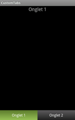
Vous devriez désormais avoir des onglets personnalisés. Si vous souhaitez mettre en place un séparateur vous pouvez ajouter la ligne suivante dans votre activity.
// Dans le onCreate
this.tabHost = getTabHost();
// On définit le séparateur
this.tabHost.getTabWidget().setDividerDrawable(R.drawable.tab_divider);
Et voilà vous avez crée des onglets à votre goût, avec vos couleurs. Pour réaliser ce tutoriel je me suis inspiré du travail de Josh Thought (en).
N'hésitez pas à signaler d'éventuelles erreurs via le billet du blog, vous pouvez télécharger les sources du projet en cliquant sur ce lien.